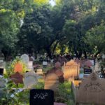
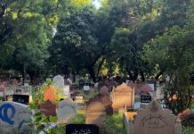
'Do Gaz Zameen Na Mili Kuu-e-Yaar Mein': Muslims in Delhi Struggle to Find a Place to Bury Their DeadOct 16, 2025
Clean Streets With Closed Doors? Muslims in Indore 'Face Boycotts and Targeted Exclusion'Oct 12, 2025
They Stole 9 Years of My Life': Framed in 2006 Mumbai Blasts, Wahid Shaikh Demands Rs 9 Crore for Wrongful JailSep 29, 2025
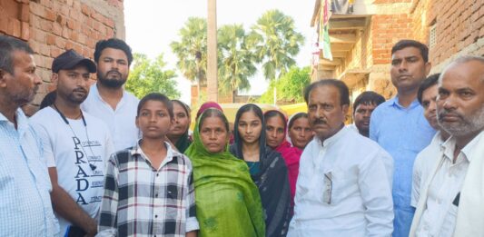
Rs 5 That Cost a Life: Muslim Vendor Murdered in Broad Daylight in Bihar Over Tiny Market FeeSep 25, 2025
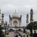
Once a Rival to Taj Mahal, Mughal Gem Bibi Ka Maqbara in Aurangabad Struggles to Survive, Loses Its LusterSep 25, 2025
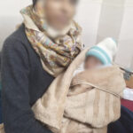
Born Poor, Mauled to Death: Tribal Infants Allegedly Killed by Rats in MP’s Largest Govt Hospital, Admin Attempted to Cremate as ‘Unclaimed’Sep 13, 2025
'Do Gaz Zameen Na Mili Kuu-e-Yaar Mein': Muslims in Delhi Struggle to Find a Place to Bury Their DeadOct 16, 2025
Bhimayana: Where Gond Art Breathes and Ambedkar Speaks - A Visual Rebellion Against Caste Through Tribal Aesthetics SoulAug 7, 2025
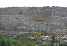
'Sometimes My Chest Burns, But I Still Go Up': The Silent Suffering of Women Who Survive on Delhi’s Garbage MountainsAug 3, 2025
Born Poor, Mauled to Death: Tribal Infants Allegedly Killed by Rats in MP’s Largest Govt Hospital, Admin Attempted to Cremate as ‘Unclaimed’Sep 13, 2025
‘Revert to Be Buried’: In Chhattisgarh, Even Death Offers Tribal Christians No Escape From 'Ghar Wapsi'
Bhimayana: Where Gond Art Breathes and Ambedkar Speaks - A Visual Rebellion Against Caste Through Tribal Aesthetics Soul
Branded Witches, Beaten by Mobs, Burned Alive - In the Land of Goddesses, India’s Women Still Die Under the Curse of Superstition
They Stole 9 Years of My Life': Framed in 2006 Mumbai Blasts, Wahid Shaikh Demands Rs 9 Crore for Wrongful JailSep 29, 2025
'I'm Proud to Be a Bengali': Meet Nilufa Yasmin Who Topped UGC NET 2025 With 100%, Earned CM's Praise
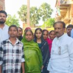
Rs 5 That Cost a Life: Muslim Vendor Murdered in Broad Daylight in Bihar Over Tiny Market FeeSep 25, 2025
He Wore Hope Like a Uniform, Hate Tore It Off: Suleman was Lynched to Death in His Village in Maharashtra Over 'Love Jihad' Claim